Mobile Commerce Is Now the Majority - What That Means for Your Ecommerce Website Design
Updated: Jul 16
Table of Contents
Mobile Commerce Has Become the Default Shopping Channel

For most ecommerce businesses, mobile is no longer a secondary channel. It is where most customers discover, browse and buy.
This shift is visible globally and in Singapore. By 2025, smartphones accounted for nearly 80% of global retail website visits and generated the majority of online orders. Mobile also represented 57% of all ecommerce transactions in 2024, a figure projected to continue growing in the coming years.
Singapore is even more mobile-centric. The 2025 Global Digital Shopping Index found that 65% of all retail transactions in Singapore are now conducted through mobile devices, making the country one of the world's leading mobile shopping markets.

The implication is straightforward: if your ecommerce website is difficult to navigate, slow to load or frustrating to use on a smartphone, a large proportion of potential customers will never reach checkout.
Mobile optimisation is a core requirement for ecommerce performance.
How Mobile Is Changing the Shopping Journey
Mobile Shopping Journeys Are Less Predictable
Many ecommerce websites are still structured around a familiar assumption: shoppers arrive on the homepage, browse categories and eventually reach a product page.
That journey still exists, but mobile shopping behaviour is often less linear.
Customers may discover a product through social content, a paid advertisement, a recommendation from a friend, a marketplace listing or a search result. They may enter the website at different points and move through the buying journey in different ways.

As a result, businesses can no longer assume that visitors will start at the homepage or follow a predefined path through the site.
For ecommerce websites, this means every key page should be capable of helping visitors understand the brand, evaluate the offer and move towards a purchase.
Search matters more than navigation
On desktop, shoppers are more likely to browse categories and navigate through menus. On mobile, they are more likely to search.
69% of consumers head straight for the search bar when they land on a shopping site. This reflects a simple reality: browsing through multiple menu levels is much harder on a small screen than typing a few keywords.
As mobile commerce continues to grow, search is becoming one of the most important pathways to purchase.

Mobile Users Decide Faster
Mobile shopping does not just change where people shop. It changes how quickly they evaluate a product.
Research from Meta's conversion optimisation guidance found that key information should appear within the first few screens of a mobile page. Details such as price, availability, delivery information, reviews and the primary call to action should be visible early, rather than buried deep in the page.

Mobile users are less willing to scroll through large blocks of content to find basic information.
They expect to understand the offer quickly and know exactly what action to take next.
Mobile Sessions Are Often Fragmented
Unlike desktop users, mobile shoppers frequently return to the same product multiple times before making a purchase.
A customer might discover a product through social media, revisit it later through search and return again before finally checking out. Each visit is an opportunity to convert, but only if the page is easy to understand at a glance.
This means product pages should be designed for quick scanning rather than a long, linear reading experience.
Product Pages Have Become Landing Pages
That changes the role of the product page.
It is no longer just a place to display product information. It also needs to introduce the brand, build trust and guide the purchase decision.
Research from Google on mobile landing page optimisation highlights that mobile users expect to land on the exact page that matches their intent. Sending someone from a product-focused ad to a homepage or category page creates unnecessary friction and increases the likelihood of abandonment.
ICTS Digital Transformation helps businesses optimise product pages to support discovery, trust, and faster purchase decisions.
What These Mean for Ecommerce Websites
Once a visitor lands on a product page, the most important information should be immediately visible and easy to understand.
Prioritise:
Product value and key benefits
Pricing and availability
Reviews and trust signals
Delivery and returns information
A clear call to action
Page performance is equally important. If the first page a visitor sees is slow to load or difficult to use on mobile, the opportunity to convert may be lost before the shopping journey even begins.
Designing for Mobile Shopping
Limited Screen Space Requires Better Content Hierarchy
Designing for mobile may seem restrictive, but it often produces a better user experience.
On a desktop screen, it is easy to add more navigation items, banners, pop-ups and promotional content. Mobile offers far less space. As a result, businesses are forced to prioritise what matters most.
That constraint can be valuable. It encourages a clearer content hierarchy and a simpler path to conversion.
Responsive Design vs Mobile-First Design
These terms are often used interchangeably, but they are not the same.

Responsive design starts with a desktop layout and adapts it to smaller screens.
Mobile-first design starts with the mobile experience and then expands it for larger screens.
The difference is more than visual. A mobile-first approach tends to place greater emphasis on speed, usability and prioritising the most important content.
Why Mobile-First Matters for Ecommerce
A well-executed mobile-first ecommerce website typically benefits from:
Faster loading pages
Clearer content hierarchy
More intuitive touch interactions
Fewer distractions competing for attention
A simpler path to purchase
Perhaps the biggest advantage is that mobile-first forces every design decision to answer a simple question:
Does this help customers make a buying decision?
If the answer is No, it probably does not deserve valuable screen space.
Search and Navigation Need Different Priorities
As shoppers increasingly rely on search to find products, navigation also needs to evolve.
Many ecommerce websites still use desktop-style navigation, with deep category trees and multiple submenu levels. While this works reasonably well on larger screens, it becomes much harder to use on mobile devices. Baymard's ecommerce benchmarking consistently shows that navigation remains a common usability challenge across mobile ecommerce websites.
Rather than exposing every category at once, mobile ecommerce websites should make it easy for customers to either search directly or reach popular product categories quickly.
A well-designed mobile shopping experience should include:
A highly visible search bar
Relevant and accurate search results
Filters that quickly narrow large product catalogues
Simple, easy-to-scan navigation
Once shoppers reach a category page, filters often become just as important as navigation itself. Options such as price, size, availability and product attributes help customers reduce hundreds of products to a shortlist in just a few taps.
The easier it is for customers to find what they are looking for, the more likely they are to continue towards a purchase.
To learn more about the ecommerce features that improve product discovery and customer experience, read 67 Must-have Features of an Online Store Website.
ICTS Digital Transformation helps businesses improve product discovery through better search, filtering, and mobile navigation.
Convenience Is Now the Baseline
Customers Compare You to the Best Mobile Experiences
Mobile shoppers do not judge your website against other businesses in your industry.
More often, they compare it to the ecommerce experiences they use every day — platforms such as Shopee, Lazada and Amazon.
These platforms have shaped expectations around speed, convenience and checkout simplicity. As a result, even small friction points on a brand-owned ecommerce website can feel more noticeable than they once did.

The 2025 Global Digital Shopping Index found that consumers place the highest value on convenient payment options and loyalty or rewards programmes. Fast, seamless checkout is increasingly viewed as a baseline expectation rather than a competitive advantage.
Local Expectations Matter
For ecommerce businesses in Singapore, customer expectations are shaped by local payment and shopping habits.
Some practical examples include:
Supporting commonly used payment methods such as PayNow and GrabPay
Minimising the number of steps required to complete a purchase
Allowing customers to check out without unnecessary form filling
Providing clear delivery and shipping information before checkout
Research consistently shows that customers are often willing to wait a few days for delivery if expectations are communicated clearly. Uncertainty is usually a bigger source of friction than the delivery timeline itself.
Focus on Removing Friction
Most ecommerce businesses cannot replicate the infrastructure of major marketplaces.
That is not the goal.
The goal is to remove unnecessary friction from the buying journey. The easier it is for customers to understand the offer, complete payment and know what happens next, the more likely they are to convert.
Mobile-First Is a Business Requirement, Not a Design Trend
Mobile-First Is No Longer Optional
Google completed its transition to mobile-first indexing in 2023. In simple terms, Google primarily evaluates the mobile version of a website when determining search rankings.
For ecommerce businesses, this means mobile performance affects more than just user experience. It can also influence how easily customers find your products through search.
A site that loads slowly, displays poorly on smartphones or provides a frustrating mobile experience is likely to face both SEO and conversion challenges.
The Impact Goes Beyond Search Rankings
The business impact becomes even clearer when looking at conversion performance.
Research published by JMango360 found that mobile apps convert significantly better than mobile websites. While most ecommerce businesses do not need a dedicated app, the research highlights an important point: shoppers are more likely to buy when the mobile experience is fast, intuitive and designed around how they actually use their phones.
The lesson is not that every business needs an app. It is that mobile-first experiences consistently outperform experiences that were originally designed for desktop and later adapted for smaller screens.
What This Means for Ecommerce Websites

A mobile-first approach typically leads to:
Faster page loading
Better usability on smartphones
More streamlined checkout journeys
Stronger Core Web Vitals performance
Better support for search visibility
Today, mobile-first is not a feature or an upgrade. It is the foundation on which successful ecommerce websites are built.
To learn more about choosing an ecommerce platform that supports modern mobile shopping experiences, read Wix vs Webflow vs Shopify: Which Platform Is Right for Your Business?.
What Winning Ecommerce Websites in 2026 Have in Common
The best-performing mobile stores are not always the ones with the biggest budgets or the most advanced technology.
More often, they succeed because they remove friction and make it easier for customers to buy.
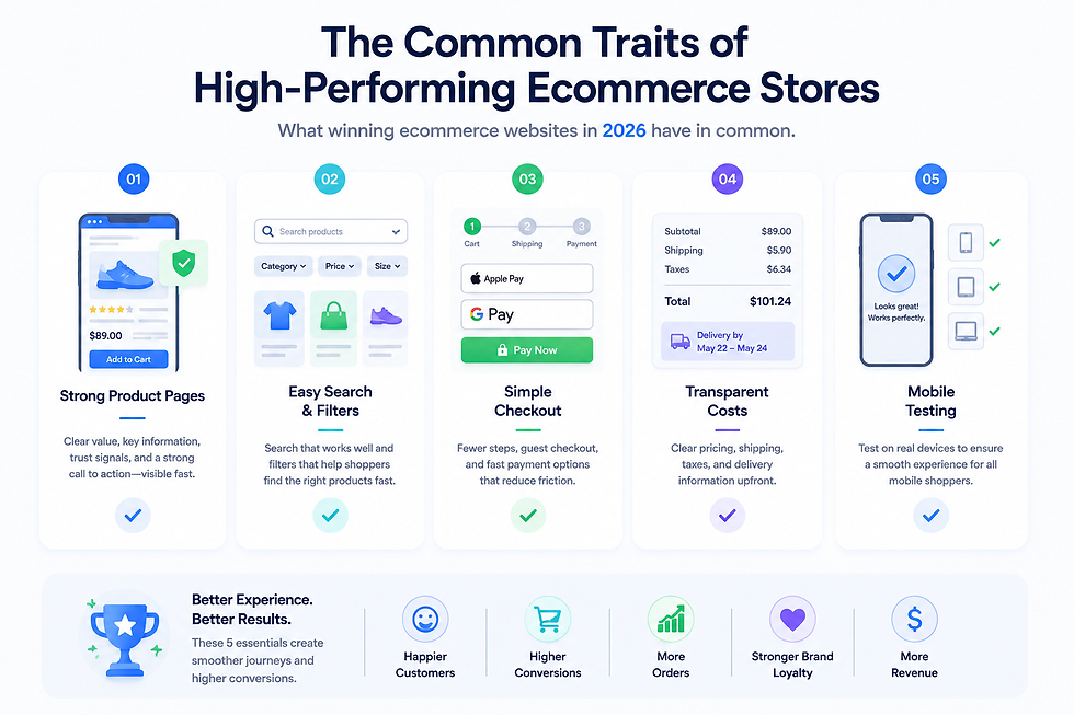
Design Product Pages for First-Time Visitors
Many mobile shoppers arrive directly on a product page from search, social media or paid ads.
High-performing stores assume visitors know little about the brand. Product pages are designed to build trust, answer key questions and support the purchase decision immediately.
Make Checkout as Simple as Possible
According to Baymard Institute research, checkout friction remains one of the biggest causes of mobile cart abandonment.
Strong ecommerce sites reduce unnecessary steps by:
Keeping forms short
Offering guest checkout
Supporting digital wallets and fast payment methods
The goal is simple: make completing a purchase feel effortless.
Help Shoppers Find Products Quickly
Search and filtering are often overlooked, but they have a direct impact on conversion.
High-performing stores make it easy for shoppers to:
Search from any page
Find relevant results quickly
Narrow options using clear filters
The faster customers find what they want, the more likely they are to buy.
Be Transparent About Costs
Unexpected costs remain one of the most common reasons for cart abandonment.
Rather than waiting until checkout, successful stores display key information early, including:
Product pricing
Shipping costs or estimates
Delivery timelines
Returns information
This reduces uncertainty and helps customers make decisions with confidence.
Test on Real Mobile Devices
A mobile experience that looks good in a desktop browser preview may still frustrate real users.
Issues such as small tap targets, awkward form fields or poor keyboard interactions are often only discovered on actual devices.
For that reason, mobile testing should be part of the development process, not something left until after launch.
To learn more about the broader strategies that help ecommerce websites increase conversions, read How to Build an Ecommerce Website That Actually Drives Sales in 2026.
Examples of Ecommerce Websites That Put These Principles Into Practice
Many of the world's highest-performing ecommerce brands follow these same principles, even though they sell very different products.
Decathlon: Straightforward navigation, transparent fulfilment information and an efficient mobile shopping experience.
Apple: Minimal mobile design with a clear content hierarchy and a distraction-free purchase journey.
Uniqlo: Mobile-first browsing experience with intuitive product discovery and quick filtering.
Sephora: Detailed product information, customer reviews and personalised recommendations that support purchase decisions.
Warby Parker: Clear product pages, virtual try-on features and a highly streamlined buying journey.
What they have in common is not a particular design style or ecommerce platform. It is a consistent focus on removing friction at every stage of the mobile shopping journey.
That principle is achievable for SMEs as well, it does not require Amazon's budget, only thoughtful UX decisions and a clear understanding of customer behaviour.
Building or rebuilding your ecommerce site?
ICTS Digital Transformation helps businesses build and optimise ecommerce websites with a strong mobile-first focus. From platform selection to UX and conversion performance, the goal is simple: reduce friction and help more visitors become customers.
Key Takeaways
Mobile is now the primary ecommerce environment. For many businesses, the majority of traffic, product discovery, and purchases now happen on smartphones rather than desktops.
Customers no longer follow a predictable shopping journey. Mobile shoppers may arrive from search, social media, ads, or recommendations, which means every key page needs to support discovery, trust, and purchase decisions.
Product pages have become landing pages. Mobile visitors often enter directly on a product page, making it essential to communicate value, trust, pricing, and next steps immediately.
Limited screen space forces better prioritisation. Mobile-first design encourages businesses to focus on the information customers need most instead of overwhelming them with content and features.
Search is becoming more important than navigation. Mobile shoppers are more likely to search than browse through complex menu structures, making search and filtering critical ecommerce features.
Convenience is now a baseline expectation. Customers expect fast-loading pages, simple checkout experiences, familiar payment methods, and clear delivery information before they commit to a purchase.
Mobile-first is a business strategy, not just a design approach. It influences user experience, conversion performance, website speed, and even search visibility through Google's mobile-first indexing.
The best ecommerce websites remove friction at every stage. They help customers find products quickly, understand information easily, and complete purchases with minimal effort.
Successful ecommerce websites in 2026 are designed around how people actually shop on mobile. The goal is not to shrink a desktop website onto a smaller screen, but to create an experience that feels natural on a smartphone.


